While our default logo is orange, use the black or white version on layouts that are black and white only. You can also use the white version on dark backgrounds so it's easy to see.


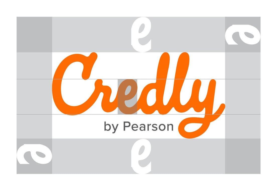
To make sure our logo is legible, and to maintain its integrity, keep the area surrounding it free of other elements. The minimum clearspace around the logo is equal to the cap height of the "e."
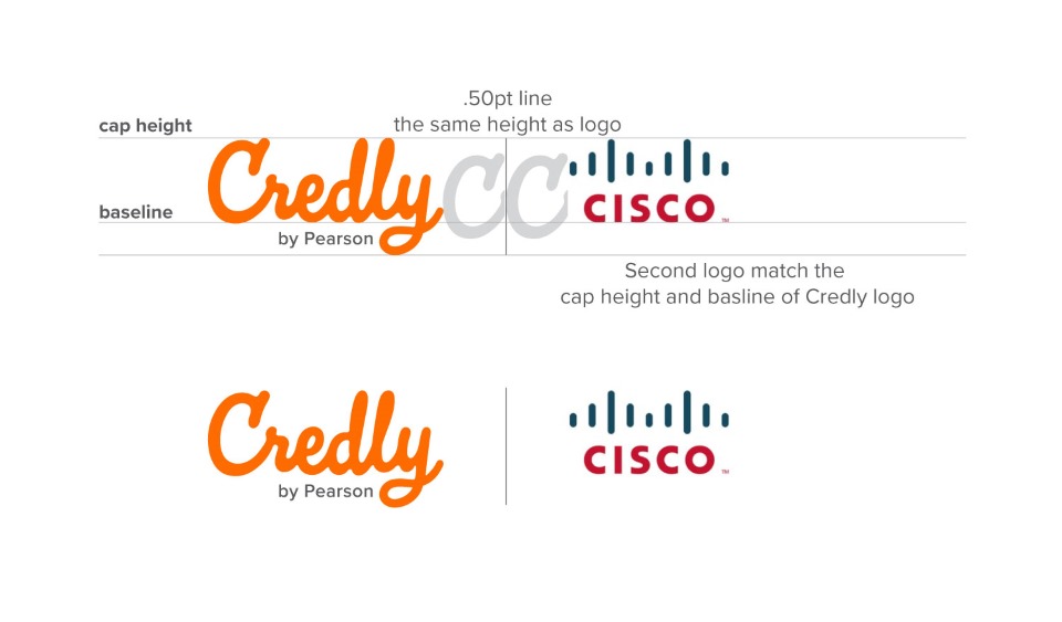
Logo Alignment
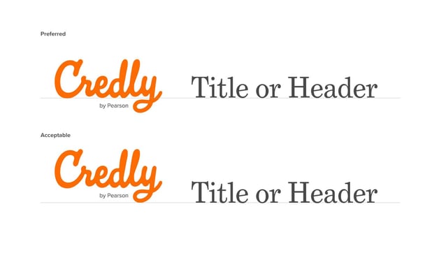
It is preferred to align the logo on the baseline. Alignment along the the bottom of the logo is also acceptable.
When locking up the logo follow these guidelines:
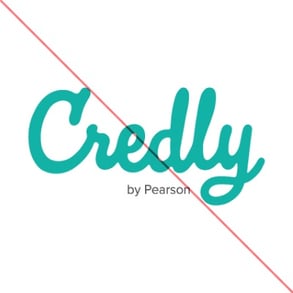
The logo should never be any color other than orange, black, or white.
Never stretch or skew the logo. Always scale proportionally.

Never place the logo on a busy pattern or background.
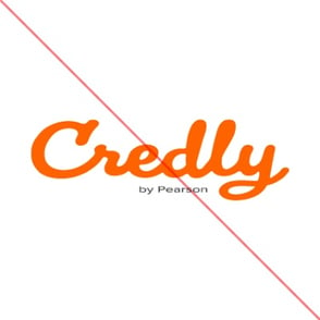
No drop shadows! Please and thank you.

Do not add a tagline or words to the logo.

Never type out the logo in another script font in place of the logo.

Headlines: Grad Bold
Our brand color palette is vibrant and diverse. Colors have been
carefully chosen to provide flexibility while keeping accessibility in mind.
Neutrals: These colors are used as the base for all design.
Use Chalk White for text or as a background color and Mist Grey in
limited cases. Use Ink Black for text, illustration and strokes. Do not
use Ink Black as a background.